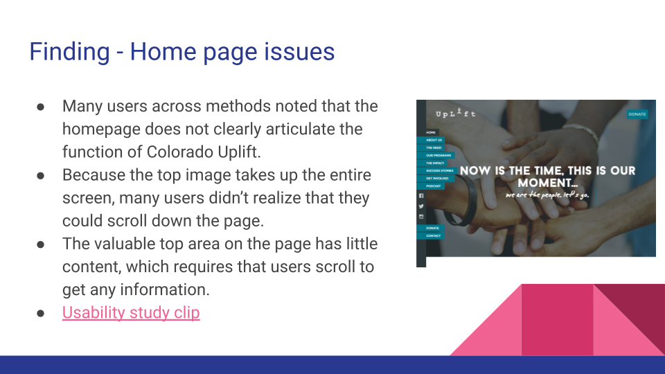
Latitude XT2 With SSD Review Update

March 9th, 2010 at 5:55 pm

In a previous post, I reviewed my Latitude XT2 Tablet PC with Windows 7 Beta, and I noted that I may buy an SSD in the future. Well, the future is now, and I recently purchased an Intel X-18m second generation drive and installed it in my computer.

Quantitatively, the numbers show a marked increase in both the Windows Experience Index and the HD Tune results, seen below. Qualitatively, the difference is amazing. My computer boots from a cold start to a working desktop in under 20 seconds, and it takes mere seconds to install a program like Firefox. It almost feels like I have a whole new computer. Certainly worth the ~$230 for the 80 gigabyte drive.

WEI with SSD - 7.7 for HDD

WEI with SSD - 7.7 for HDD

WEI without SSD - 4.6 for HD

WEI without SSD - 4.6 for HDD

HD Tune with SSD

HD Tune with SSD

HD Tune without SSD

HD Tune without SSD

Tablet PC, Uncategorized ,

Apple iPad vs. Tablet PC: A Comparison

January 28th, 2010 at 9:02 am

With the recent announcement of the iPad, I thought this would be a good time to do a comparison with the modern Tablet PC. As an on and off user of Tablet PCs for the past 7 years, I’ve had a lot of experience with the platform as it has moved from Windows XP Tablet Edition and Pentium III processors to modern Windows 7 versions on Core2 Duos. Still, I’m intrigued what Steve’s demonstration yesterday, and while I obviously haven’t had a chance to hold the new iPad, I have watched a number of demonstration videos and read several hands on, and I’ve used an iPhone on and off for almost two years. Thus I feel qualified enough to do a high-level comparison between the Apple iPad, and my Tablet PC, the Dell Latitude XT2.

iPad_home dell-latitude-xt2-multi-touch-tablet-pc
Feature Apple iPad Dell Latitude XT2
Screen 9.6″ Capacitive, multi-touch, LED-backlit at 1024×768 12.1″ Capacitive, multi-touch, LED-backlit at 1280×768, stylus supported
Weight 1.5 lbs 3.78 lbs
Processor 1 Ghz Apple A4 (ARM based) 1.4 Ghz Intel Core2 Duo ULV
Storage Up to 64 gigabytes of flash storage Up to 256 gigabytes of flash storage
Battery Life ~10 hours ~3.5 hours, or 9 hours with extended battery
Wi-Fi & Bluetooth Yes Yes
3G Optional, through AT&T at a discount Optional, through AT&T, Verizon, or Sprint
Connectivity Ports Docking connector, headphone, mic 2 USB, 1 USB/eSata, Expresscard, SD Card, Gigabit Ethernet, VGA, headphone, mic
Accelerometer Yes No
Build-in Hardware Keyboard No Yes
Multitasking No Yes
Adobe Flash No Yes
Built-in Camera No No
Applications available Select iPad apps at launch, including iLife, 140,000 scaled iPhone apps Complete Windows library
Price Begins at $499 Begins at ~$1999 ($999 refurbished)

Screen

The Latitude XT2 has a larger, more high resolution screen with the added advantage of having a built in stylus, which gives it the win here. The stylus also allows for effective note scribbling, something that is difficult to do with fingers. That being said, even with Windows 7’s new gesture support, Tablet PCs just don’t have the finger-friendliness of the iPhone, and, as an extension, the iPad. The iPad’s screen also looked a little brighter, and overall more fun to use.

Weight

While my XT2 feels fairly light, the added components and keyboard can’t compete with the slim, streamlined iPad. While I haven’t held one in my hand, I have to imagine that an iPad would be more comfortable for long periods of reading or browsing, though I haven’t really had issues with my XT2.

Processor

Apple has flexed its hardware muscles after the acquisition of P.A. Semi almost 2 years ago. The 1Ghz ARM-based A4 chip appears to be very fast, especially when paired with Flash memory and optimized software. The Core2 Duo chip in the XT2 may be a little faster, but without the level of software optimization that the iPad has, I’m going to rate this as a tie.

Storage

The iPad can hold up to 64 gigabytes of flash memory, compared with 256 gigabyes for the XT2 (and likely 512 gigabytes soon). Download some high-definition movies, and 64 gigbytes goes pretty fast. In addition, the XT2 can use ExpressCard and USB external storage and even USB Blu-Ray drives.

Battery Life

With 10 hours of battery life, I’m going to have to give this one to Apple. The Latitude (and most Tablet PCs) can get an extra battery, but it adds cost and weight. The iPad battery is not removable, unfortunately, but this seems to be the Apple trend of late.

Wireless Connectivity

Both machines have full 802.11 a/b/g/n Wi-fi and Bluetooth, and also 3G access. The Latitude offers a greater variety of carriers for 3G, but the iPad has a much cheaper data plan at $30, so I’m calling 3G as a tie, depending on whether you value price or flexibility.

Connectivity Ports

This is where the decision to make the iPad a larger iPhone rather than a small Macbook begins to hurt. The lack of any real connectivity options means that it will be difficult to expand the iPad’s built-in memory, and a large range of USB devices, such as webcams and DVD drives, are not going to be available. The docking connector does allow video out with an adapter, but at a paltry 1024×768 resolution (the XT2 does up to 1920×1080 over VGA, and can do HDMI over the docking station).

Accelerometer/Keyboard and Gaming

The lack of a hardware keyboard on the iPad will probably be more off-putting than the lack of an accelerometer on the XT2. The XT2 can also use a mouse, which allows for a wide variety of mouse/keyboard gaming options. While I’ve enjoyed the accelerometer on my iPhone, I generally find it a bit gimmicky for gaming, and first-person shooters just don’t play well with touch-screen controls.

Multi-tasking

Another major Achilles heel for the iPad, and something I really hope is fixed in the iPhone OS 4.0 update. The lack of multi-tasking is problematic enough on the iPhone, but I know I’ll really find myself missing it on the almost 10″ screen. Why can’t I run an IM window next to my Flash game with Pandora streaming in the background (a common occurrence on my XT2)?

Adobe Flash Support

Similar to multi-tasking, this moves from a weakness on the iPhone to a serious flaw on the iPad. Steve called out the iPad as the ultimate browsing experience, especially over “underpowered” netbooks, but browsing without Flash means a decent chuck of the web is not available. Again, I’m keeping my fingers crossed for an OS 4.0 update, but I see this as less likely than multi-tasking support, though arguably more important.

Applications

I think that App developers may come up with some really neat applications for the iPad, but for the present, the 140,000 pixelated iPhone apps don’t compare with the huge library of Windows software available. In addition, Apple has rather draconian application development policies. Without full access to the iPad file system and hardware, I fear that it will again fall on the jailbreak community to develop useful utilities.

Price

Tablet PCs have failed to get mass-market adoption for almost a decade, and a major reason is that they are more costly than a laptop with similar specs. Apple made a smart move by offering a model with less persistent memory and no 3G at a lower price point. To be fair, the XT2 is one of the most expensive Tablet PCs on the market, as you can find models like HP’s Touchsmart at a $949 price with up to 20% discounts. In addition, most people using Tablet PCs do not have another laptop, which many iPad users will still want to price in a laptop as well as the iPad, leaving less available budget. Still, the bottom line is that the iPad runs away with this one.

Conclusion

The iPad has received its share of criticism in the past 24 hours, and much of it centers around a key design reality: the iPad is not a “Macbook Light”; it is an “iPhone heavy”. As a result, it has significant weaknesses compared to traditional laptops, unlike Tablet PCs, which are “Laptops Plus”. The comparison chart illustrates this, as the iPad only really wins on weight, battery, and price. The iPad is really for people that want a lightweight, cheap, limited device in addition to their laptop or instead of their laptop. In that respect, it fills the same niche as netbooks and eReaders, rather than today’s Tablet PCs, and netbooks and eReaders will be the real competitor, especially as more netbooks add touch capabilities.

The final piece of the puzzle is the full iPad experience. On paper, the iPad has a tough time competing with today’s Tablet PCs, and even today’s netbooks in many respects. Having not held one in my hand, I haven’t had the “magical” experience, but a combination of killer apps and a seamless, pleasurable UI may allow the iPad to make a name for itself. Time will tell.

As for me, I’m still waiting for the Microsoft Courier.

Tablet PC, apple, gadgets , , , ,

3 tips on designing an effective e-commerce checkout

November 27th, 2009 at 10:29 pm

Of the many different types of websites, none has received as much scrutiny as e-commerce, a category where ROI can be measured more easily than any other. And in e-commerce sites, the most studied area is the checkout, a multi-step process where users often fall off before completing their purchase. In my own research attempts, I found considerable amounts of information, but little written from a usability design perspective.

In this article, I will highlight three important steps that can be taken to improve the usability and ultimately the success of an online checkout. Many of these suggestions are based on common user experience design heuristics, the most well-known having been produced by Jakob Nielsen. These heuristics are violated both consciously and unconsciously, often by designers or clients who feel that users should be funneled through a checkout to the point that information and paths that would allow a user to postpone a purchase are removed. Unfortunately, this often leads only to frustrated users who will be unwilling to complete a purchase.

Tip #1 – Provide clear direction of paths on the sign-in page

amazon-sign-in lenovo-sign-in
Problematic Example – Amazon.com Good Example – Lenovo.com

When a user makes the decision to check out, they need to see sign-in options. A user may already have an existing account on the site, or they may be completely new. In addition, some new users may wish to create an account on the site, while other users simply want to check out as quickly as possible. A single page is usually necessary to direct these different types of users to the proper path.

Such a page should contain at least 3 elements:

  • Username and password fields and a sign in button for existing users.
  • A button or link for users that wish to create an account.
  • A button or link for users that wish to check out without creating an account (often called Guest Checkout).

Sometimes account creation is tied in as an optional step in the Guest Checkout, but if so, this should be clearly indicated on the page. In addition, many sites support 3rd party payment and checkout options like Paypal or Google Checkout, and these options should be visible on this page as well.

While most e-commerce sites include these elements, the presentation often suffers. One or more options may be overshadowed by another, or widget placement makes it difficult for users to understand what they need to do for each path. For example, the Amazon page uses the same form field and action button for both new and returning users, and uses a radio button to select user type. This blurs the line between the paths available, and leads many users to encounter error messages or begin down the wrong path. In addition, there is no guest checkout.

In contrast, the Lenovo e-commerce site uses the page architecture and design to clearly lay out the path for returning and new users. For new users, both the account sign-up and Guest Checkout are clearly visible.

Tip #2 – Let the users know where they are

zappos-address k-mart-address
Problematic Example – Zappos.com Good Example – Kmart.com

From Jakob Neilson’s 10 heuristics to Keith Instone’s Stress Test, user experience experts agree that it is important for users to be aware of their position in a website. It stands to reason that users should easily be able to access relevant information about their position and step in the checkout process. Designers may balk at including this information, saying that it will clutter the page and overwhelm the users, but good designers can work this information in an effective way. The following should be available on all steps of the checkout, not just the final Review and Confirm:

  • Clearly define the number and name of each step in the checkout process (usually at the top of the page).
  • Show the user where they are in the checkout process.
  • Clearly indicate what the user needs to do to continue by highlighting the Continue button and giving it a label that describes the next step
  • Show the user relevant information from previous steps, such as items in cart, shipping costs, total costs, shipping addresses, etc.

Zappos demonstrates a lack of useful information. The Zappos checkout does not even include a listing of the steps in the checkout process or a clear header that describes the current step. There is no information about the items in the user’s cart. Despite the lack of this important information, the page is very cluttered and text is tiny and difficult to read. Even the Continue button, which should pop-out, is buried under text.

In contrast, the K-Mart site is clean and contains significant amounts of white space, yet also provides relevant information to the user. The graphic at the top of the screen illustrates the steps in the checkout process and uses color to clearly show users where they are in the process. Information about the users order is provided in the right hand column, including a full breakdown of cost. Finally, the Continue button is clearly visible and well-positioned at the bottom of the form, though the labeling should call out the next step, such as “Continue to Shipping Options”.

Tip #3 – Let the user move freely

buycom-address Sonystyle.com checkout
Problematic Example – Buy.com Good Example – Sonystyle.com

Steve Krug, in his slightly dated, yet still excellent web usability book, Don’t Make Me Think, uses an e-commerce checkout as an example of a page where global navigation may not be necessary, though he still recommends a minimal navigation with a home link. Personally, I cringe at the number of e-commerce checkouts that remove most or all navigation options from the checkout pages, forcing the users down a narrow funnel. The problem is that some users may wish to leave the checkout for a variety of reasons but still come back. Perhaps they think of another item they wish to purchase, or want to fill out there cart to reach the minimum purchase threshold for free shipping. Many clients feel that they need to remove anything but the Next Step link in a checkout in order to drive users to complete their shopping. Unfortunately, boxing these types of users in will not push them toward completing their transaction. Instead, these users may become frustrated and abandon the checkout all together. The following should be available throughout the checkout process:

  • Global Navigation. Users have come to rely on it throughout their shopping experience. Taking it away reduces the users control and navigation options, and can raise a flag for the user if the look and feel changes enough to make them feel they have gone to another site for the checkout.
  • Back to cart button. Users that need to alter their cart should have a clear way to do so, in addition to visualizing their cart during every step of the checkout process.
  • Clearly labeled Next Step button. This was mentioned earlier, but it bears repeating. The button should be visible and pop out on the page.
  • Review and Confirm Step with links to each step in the checkout process, including their cart. The user needs to know that they have a last chance to look things over. If their is a problem with their information or cart contents, they should be able to easily change them.

The Buy.com checkout removes the entire global navigation, replacing it with a checkout progress indicator and Buy.com logo. Unfortunately, neither are clickable, leaving the user with “Save and Continue” as her only option. The lack of the global navigation menu also changes the look of the site, though the color scheme and Buy.com logo keep the site from appearing too jarring. In its defense, the Buy.com Review and Confirm page does include links to change a shipping address or go back to their cart, though these links are very small and easy to miss.

In contrast, the Sonystyle.com checkout includes the global navigation throughout the checkout process, adding the checkout navigation as an additional, prominent piece of information. A clearly visible Back to Cart button is also visible on all steps, and the user can easily change her shipping information from the previous step.

Conclusion and a few words on one page checkouts

So that concludes my three tips, which boil down to two important web heuristics: give the user sufficient information about where they are and where they can go, and give the user the freedom to move where they wish to.

A final point I wish to touch on is the idea of a one-page checkout. Some sites, such as eforcity.com, will use small points, four columns, and a scrolling page to fit all of a users shipping and billing options on one page. This is problematic for several reasons, not the least being an information overload. Other sites, such as Gap.com, use an AJAX driven interface to expand and collapse different steps in an acordian fashion, retaining a multiple step process without forcing a single page load. While this solution has its merits, it is important to consider the accessibility implications of implementing a checkout that relies so heavily on JavaScript, particularly in light of ADA (Americans with Disabilities Act) lawsuits such as the one that hit Target 3 years ago. In addition, users have become familiar with the three-page checkout, and a new paradigm may confuse some users. That being said, there is clearly a future for checkouts like Gap.com.

Gap.com checkout (AJAX expandable)

Gap.com checkout (AJAX expandable)

Original, information architecture ,

I’m part of the Facebook redesign?

October 7th, 2009 at 6:59 am

For the past several days, I noticed that the interface around my Facebook account has been a little different, and I assumed that they were rolling out changes to everyone. It looks like that is not entirely the case, based on stories like this that have showed up on my Techmeme feed. Apparently I am part of a limited group of Facebook users that is testing the system (and without my knowledge until now). Overall, I generally don’t mind the changes, though I wish there was a way to collapse the posting panel after you click the button to expand it. The screenshot below shows my News Feed using the new interface.

facebook-interface2

Tech News , ,

Enlighten wins three awards!

September 25th, 2009 at 8:09 am

My company, Enlighten, has recently won three web awards from the the 2009 Web Marketing Association’s WebAward Competition. Check them out below:

Full press release can be viewed here.

Tech News , ,

Quick Review of my New Latitude XT2 with Windows 7 Beta

May 9th, 2009 at 7:46 am

Update: I recently purchased an Intel X-18M second generation solid state drive, and it has made a huge difference. Read more about it here.

I took advantage of the deal I mentioned in my last post and picked up a Dell Latitude XT2 Tablet PC. I have always liked Tablets, ever since I began programing an e-Textbook program on an HP TC1000, which was a great tablet but a bit small and slow. Last year I took advantage of a similar deal to purchase a Latitude XT, but it was quickly annexed by my significant other, which left me using my old Fujitsu s2110, which wasn’t the fasted machine when I bought it 3.5 years ago, though still a great laptop.

Fast forward to today – I now have a Latitude XT2 with Windows 7 Beta installed. The Latitude XT line is one of only two Tablet PC models that have a multi-touch capacitive screen, which Microsoft is integrating tightly into Windows 7. You can have a look at a demo here (notice that they use a Latitude XT). In this review, I will be analyzing my new Latitude XT2 and comparing it with the Latitude XT to determine if it is worth the upgrade. Keep reading for benchmarks, pictures, and thoughts on both the machine and Windows 7.

img_2967

Read more…

Tablet PC, gadgets ,

Great deal on Tablet PCs

April 14th, 2009 at 7:28 am

I don’t plan to post a lot of deals here (I would refer people to Slickdeals and Fatwallet for that), but as I just took advantage of this deal, I thought I would share with other folks that might be interested in Tablet PCs.

Dell has always had good deals on its refurbished outlet items (50% off), and currently they have a Spring Clearance Sale running with a 20% coupon (CPP1002XWDHXDK), allowing users to get the Latitude XT and new Latitude XT2 for 60% off the retail price. Depending on the models available, that could mean an XT2 for $1,031, or an XT (Core Solo) for $575 (though I would go with the Core Duo for  a little extra).

I have an XT, and it’s a little slow, but certainly faster than a netbook, many of which are going for $400-$500. Add in the LED, 12 inch, WXGA screen with capacitive, multi-finger touch, and you have a nice little machine that weighs under 4 lbs. It’s also one of just a few tablets that has true multi-touch, will should be an integral part of Windows 7.

Tablet PC, gadgets ,

Internet User Experience Conference Summary

April 12th, 2009 at 7:04 pm

Just a quick summary on the IUE 1009 conference.  First, it is a local conference for Southeast Michigan, but that doesn’t mean there weren’t some quality speakers present.  As Dan Klyn pointed out, Ann Arbor can be seen as the birthplace of modern IA (check out his slides for more info).

I did do some tweeting at the conference; more than I’ve ever done actually. In fact, at one point I think I was the top contributer for #iue09. Compared to my last conference (CHI 08 in Florence), I noticed that Twitter was playing a larger role. At a panel on social networking, all of the panelists had their twitter usernames on their namecard, including Chris Barger, GM’s own Twitter guru.

I would give a summery of the talks I went to, but you can basically check out my Twitter feed for that (#iue09). A few good presentations that I could find on Slideshare:

Axure, information architecture , ,

Presentation this Thursday at IUE

March 29th, 2009 at 5:37 pm

For any readers in southeast Michigan, I’ll be presenting at the Internet User Experience conference on Thursday.  Our presentation is titled “Lessons Learned While Integrating a New IA Tool” and will focus on our experiences adopting Axure RP.

Axure, information architecture , ,

Always Innovating demos a new lightweight tablet

March 2nd, 2009 at 9:41 am

With all of the cell phones, MIDs, and tablets coming out these days, it can be hard to stand out.  A company that I have never heard of, the appropriately named Always Innovating, seems to be trying to break out from the crowd.  Their new form factor is somewhat similar to the old HP TC1000 tablet I used to have, but smaller and with a couple interesting twists. Their new netbook tablet weighs a mere 2 lbs, has an 8.9 inch screen, and battery life from 10-15 hours thanks to a low power TI OMAP ARM processor.  Of course, this means that X86 operating systems like Windows XP are out, but flavors of Linux and cellular operating systems like Android are possible.  With a pricepoint of $400, it’s certainly competitive with other netbook offerings.

More information is avaible on Always Innovating’s site.

Specs:

  • 9.4″ x 7″ x 1.4″ for 2 lbs (with keyboard)
  • ARM Texas Instruments OMAP3 chip
  • 1024×600 8.9” screen
  • Storage: 8GB micro SD card
  • Wifi 802.11b/g/n and Bluetooth
  • 3-dimensional accelerometer
  • Speakers, micro and headphone
  • 6 USB 2.0 (3 internal, 2 external, 1 mini)
  • 10h to 15 hours of battery life

touchbook

Tablet PC, gadgets , ,